ALL NEW ROKU.COM
MY ROLE: Strategy & Planning | User Research | Creative Direction | Art Direction | UI/UX | Digital Guidelines | Photo Shoot
TEAM: Executive Creative Director - Ellen Wong | UX - Andrew Turrell, Charles Crawford, Stephen Kurshner | Visual Design - Aaron Kim
AGENCY: RED Interactive
PROJECT GOAL: In the highly competitive streaming market, Roku was launching a new product lineup for the upcoming holiday season. To support the launch, they needed their site to educate users about Roku’s brand and product offering in order to push more site visitors down the conversion path. We created a web experience meant to navigate these consumers down a funnel through product content, ending at purchase.

THE APPROACH
Roku’s target audience are not tech geeks. They are looking for simplicity and value. To ensure that the new site resonated with a broad Roku target audience, we created three strategic pillars that drove all decisions from asset creation to language, tone and UI design.
THE APPROACH
Roku’s target audience are not tech geeks. They are looking for simplicity and value. To ensure that the new site resonated with a broad Roku target audience, we created three strategic pillars that drove all decisions from asset creation to language, tone and UI design.
THE APPROACH
Roku’s target audience are not tech geeks. They are looking for simplicity and value. To ensure that the new site resonated with a broad Roku target audience, we created three strategic pillars that drove all decisions from asset creation to language, tone and UI design.
THE APPROACH
Roku’s target audience are not tech geeks. They are looking for simplicity and value. To ensure that the new site resonated with a broad Roku target audience, we created three strategic pillars that drove all decisions from asset creation to language, tone and UI design.

DIGITAL GUIDELINES
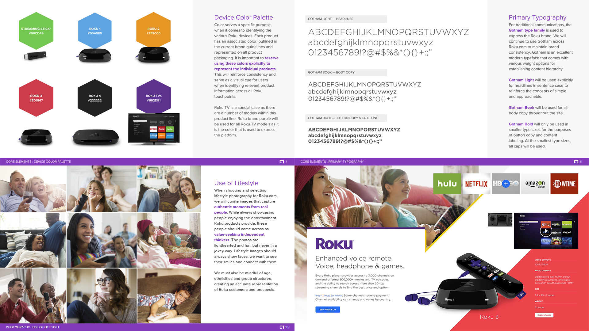
As one of our key deliverables, we created in-depth digital guidelines to pick up where the global brand standards left off. This included a set of strict rules for color, typography, photographic style, and tone of voice.
DIGITAL GUIDELINES
As one of our key deliverables, we created in-depth digital guidelines to pick up where the global brand standards left off. This included a set of strict rules for color, typography, photographic style, and tone of voice.

LIFESTYLE PHOTOSHOOT
While auditing the previous Roku website, we noticed that there was virtually no lifestyle photography present throughout the entire digital experience. To amplify the strategic pillar of approachable, we were commissioned to do a photoshoot and capture quality lifestyle imagery showing the new devices in action.

WEBSITE EXPERIENCE
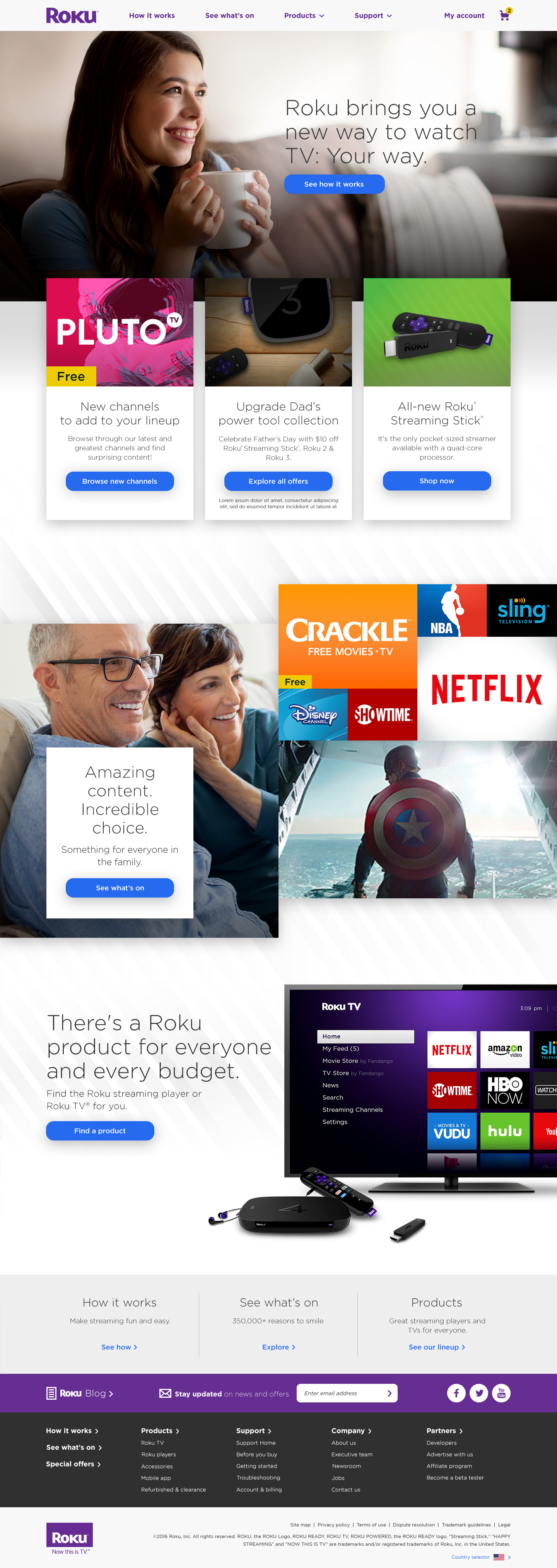
The new site provides consumers what they want most--product education, content discovery, and support. We streamlined user journeys that allow potential customers to efficiently move from discovery through conversion. The site is designed to create a clear path to follow, from ‘how it works’, through content availability and product offerings, all the way through to purchase and support.
HOMEPAGE

PRODUCT LANDING PAGE

PRODUCT DETAIL PAGE

SEE WHAT'S ON PAGE

© 2020 MARC LASSOFF. ALL RIGHTS RESERVED.
ALL CONTENT IS EXCLUSIVELY FOR PRIVATE USAGE AND NON-COMMERCIAL PURPOSES.